Long time ago, in a land far far away, I found myself sitting in a physics class (dynamics, the physics of motion) and on the first day the Professor Patterson said, “There are only 2 things you need to know about dynamics, and if you learn them, right here, right now, you will have learned 50% of the course material in the next 2 minutes. If you understand them you won’t have to come to class for the next 16 weeks”
He had captured our attention, not an easy task to capture the attention of 60 randy 20-year-old men if you didn’t have the right curves – and he didn’t.
“ The first, and more important, constitutes 40% of all you need to know.” he resumed.
A hush dropped over the room like a cone of silence, with bated breath and pencils poised, we awaited Prof. Patterson’s pronouncement.
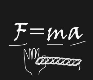
He continued, “F=ma” writing it 3 feet high on the board.Then, while underlining each letter, “Force, equals, mass, times, acceleration.”
Huh? (we already knew this)
“Oh yes, the second thing is…” he smiled, “you can’t push on a rope! Class dismissed”
Professor Patterson went on for 16 weeks to show us that yes indeed F did = m a.
It Really is Simple
So possums, I am here to tell you there are only two things you need to know and you will know 50% of everything you need to about web-design, right here, right now.
1. Connect with your audience
2. People are the same (but in different ways)
A Picture is Worth a Thousand Words
The easiest way to connect with people is to reflect to them, who they are, or who they want to be.
The fastest way to get that message across is by using images.
… a team of neuroscientists from MIT has found that the human brain can process entire images that the eye sees for as little as 13 milliseconds
So compared to reading a bunch of text, 13mS is very fast.
The pictures we choose become very important, and surprisingly, with all the stock photography available, easily and cheaply, the exact right image may not exist.
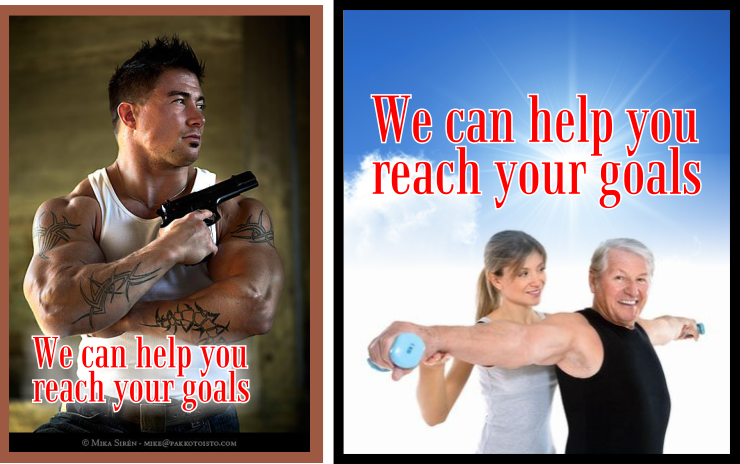
So for an example, let’s say your demographic is affluent middle-aged men, who you want to entice to a gym to work out and hire a personal trainer. I offer 2 images below. To the left we have a handsome young man, well muscled, with tattoos and a pistol. While on the right we have a man in his 60’s, in pretty good shape, being helped to do an exercise, that he can probably do, with some help from an attractive young woman – hits both counts, who they are and who they want to be.

so connecting with your audience is paramount.
Changing the Demographic
Now let us have a little fun, we are going to change the demographic. Now we want to sell gym memberships, but this time we want to attract young males, who maybe want to do a little boxing to really get in shape, and let’s say the gym is in an old downtown or industrial plaza where is affluence in not the norm. Just so we are on the same page, “guns” is slang for muscles or biceps – but our demographic knows that.
Well yes, it is kind of funny.
Fonts and Colour – Gettin’ that Loving Feeling
So now I want to push a little deeper and pull the demographic a little closer. We can safely discard the image on the left and stick with our demographic of young males and boxing ring.
 So what I have done is firstly, took out the line about boxing and added in a pair of boxing gloves.
Then I wanted to give the impression that the gym has been around for a while and I used an older font from the Art Deco period, for the name “Gino’s Gym”
Then I wanted to be a little more modern and I used a grunge font for the tag line and rode it off the “page” a bit.
Lastly I chose a border colour to compliment the colour of the boxing gloves, making them stand out a bit more to the eye.
What have we learned
What we can take away from this is that connecting to the audience is the most important thing. We do this the fastest by using images that reflect the demographic either who they are now or who they want to be.
Secondly, we are all the same in this, we just see ourselves differently.
Thirdly, we can use fonts and colour to add dimension to our images.
There is not much more than that.


