Website design that sells the sizzle
Click this link to visit the website
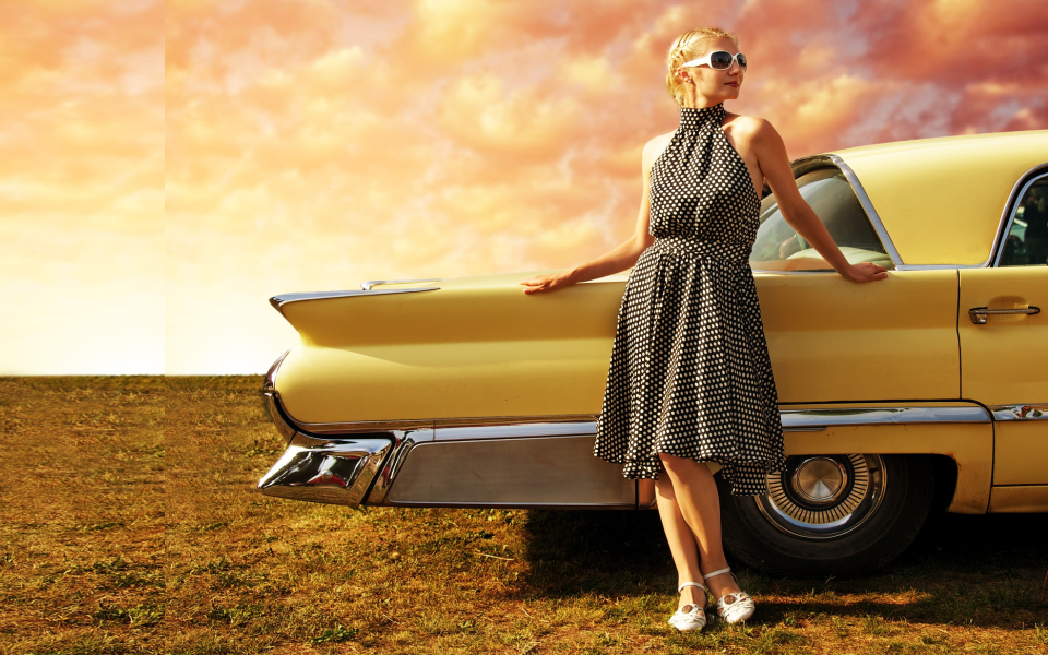
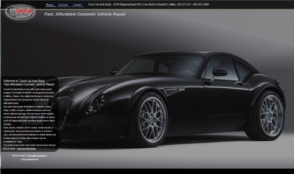
This is one of the first websites I designed using extensive javascript. The pages all occupy 100% of the screen height and width. The home page shifts through 4 different images showing that they work on cars, motorcycles, boats and light airplanes. The theme, once again, is selling the sizzle. There are not pictures of before and after a job, no pictures of mechanics working, no pictures of shop floors – the site exists to excite the imagination about hot cars, hotter bikes, and stretches the thinking into realms of boats, planes and who knows what else. All the images have sizzle throughout the site. The content is short and to the point and exists on transparent backgrounds so the images can still show through but the text remains legible.
I choose to use a redirect to a single page, no javascript site for IE pre Version 9 users. They are still out there and I call a few of them friend…they just won’t change no matter what I say.
Hope you enjoy the site.


