Click the link to see the site
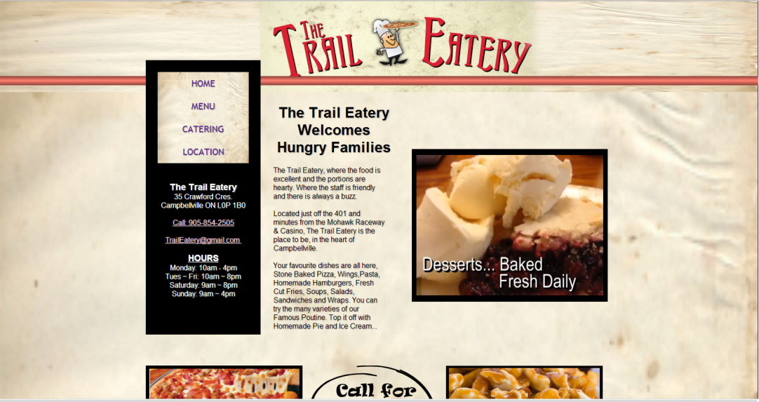
This is an early website for me back in 2009. I still really like it. Peter has not changed anything since I first put it up. The site is simple and to the point. The little video, without sound, showcases his best selling products. A call to action just peaks above the fold to draw the eye down and onward. The Menu page taught me how labour intensive this type of page can be, it takes way more time than researching and creating a 1000 word blog post. If my PHP coding had of been better at the time, maybe it would have been a little easier, as it is, it was done with straight HTML.
I always liked the menu structure I designed for this site, it contains everything you need to know and your eye lands right there, top left. I will have to remember I did this and use it again.
The site renders well on mobile without the need for extensive @media queries or separate mobile website, which is important because many of his clients are from out of town.


