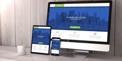
Good Graphic Design…What is it?

December 24th, 2011

Is it a Colour combination?  White space? Style?  Great art?

For me it is all these things and none of them sometimes.  It is something else, that “Je ne sais quoi” that melds advertiser, media, message and observer.

MarshalI McLuhan (great Canadian Philosopher, look him up) said, “the media is the message.”  And there are times I see this more clearly than others and other times I work on the instinct that this is true.  As a result it is more difficult to work for someone I have never met.  There are times when this is necessary, say when you are working with big corporation, or you are doing third-party artwork for a client of a client, but in general, I like to meet my clients: “the advertisers.”  Hopefully clients can tell me their message, how they want it delivered (print, web, signage or vehicle-wrap) and whose attention they want to capture with the message.  Armed with this information I set out to deliver a client-based unique design that delivers an impactful message to the intended audience.

Are there rules?

Sure there are and they apply most of the time.  Would I use Disney Pink (Pantone 241) to market beer to truck drivers, probably not.  So colour matters, as does shape, font-style and overall layout.  The main point though is: get the message across, quickly and without ambiguities.  Lots of copy might work if you are sending out an annual report, but too many things on a business card or vehicle-wrap just muddies the message.

KISS – keep it super simple and a picture is worth a thousand words are great things to keep in mind.  There are a plethora of stock image sites, some of them free, which offer high-quality, low cost stock photography that can help to get your message across.  Using stock photography showing a model that looks like your intended audience, or looks like how your intended audience wants to look, is a great start, add a tag-line that drives home the client’s message like: “we are the best”, ” your life will be better if…” and a “call to action” which can simply be contact information, or “enter contest”, “redeem coupon”, or whatever the client wants the observer to do.  Add the logo and you are done…

Logos: Pictures are generally not good in logos because they are raster images (made up of dots) and usually look like they are made up of dots when you blow them up to print on a sign.  So logos need to be a vector image, which means, for the most part, somebody drew them using lines and fills.  Graphics programs will blow up vector images to billboard size without loss of image quality.  The next thing is that the same logo must work, if printed in a single colour on the corner of an envelope, i.e. 0.75″ high.  Coca-Cola is such a beautiful example of something that will work in one colour on the corner of an envelope and can be blown up to 15 stories high and still retain its integrity as a visual symbol.

So you have a colour palette, a picture that conveys emotion, a tag line, a call to action, and a logo.  So go ahead and lay it out.  This is where the rules really come into play.  Think first of overall impact, will the intended audience stop and look or will their eyes just slide on by.  The silhouette of a teen on a skateboard wearing an iPod comes to mind; grandma’s eyes don’t even recognize what it is, but every 16-year-old on the block gets it!  Choose a font, something avant-garde (every generation thinks they are avant-garde, even if they don’t know what it means).  Make the message clear and small (because young eyes see everything).  And lead the eye to the call to action…”own one today” or whatever.  Use the logo as a counterpoint to balance the design.  Voila great design.

I got a little off track in the paragraph above because the design was building as I was writing, but it does illustrate a design to an intended audience.  Obviously if we were marketing to grandma, the picture would look like her, the colours would be different, the tag line would have to be bigger and plainer and the call to action would be more traditional…”available at The Bay.”

The 2 things that would remain constant in the 2 above examples would be balance and white space, not necessarily white, just space with nothing in it.  Designs have to balance; they have to have flow, and the appearance of movement for the eye to follow.  This is partly accomplished with empty space, because over-crowded designs draw the eyes in too many different directions.

In closing, Feel your client, who are they?  What message do they want to send?  Who is the audience?  What action do they want from the audience?  Choose colour, fonts, and pictures and lay it out so there is interest at a glance, a clear message and call to action, with flow and balance in the design.

Graphic Artists and Print Docket Managers – Why

December 8th, 2011

Little did I know when I started that I would be blazing a trail for others like myself; that is people who co-process ideas using the left and the right sides of their brains.  What does this mean?  Well, it means that I can be artistic and organised at the same time; I often describe myself as a graphic artist that can balance his cheque-book, most people get that.  This also means that I have to be challenged both by creative and organizational endeavours or I do not feel satisfied.

For clients, this means that they get to have everything under one roof, the best of both worlds!  Clients explain to me what they want, who they are, who they want to reach and where they want to go.  From these meetings I can present conceptual artwork that matches personality and audience.  I can explain colours, shapes and really artistic stuff, while keeping in mind the differing layouts necessary for print or web presentation.   I can explain what works  - what doesn’t and what gets lost in translation.

After the design phase of any project is complete the design has to go somewhere; either to print or to the web.  I do not do web presentation for my clients at this time, I would usually have the client use a web designer they like and partner with the web-guy feeding him the graphics that he needs.

Print on the other hand is more complex and requires knowledge of the process from the start of the design; an idea of what form the print will take, whether it is offset, digital, large format or even grand format requires differing design attributes.

Also an understanding of the print marketplace in the GTA is essential.  The past decade has seen wholesale changes in how print is manufactured, who does it, and how they want the files delivered to them.  What was unreachable for the average client a decade ago is commonplace now while the quality and pricing is ever-changing.  Print Docket managers stay abreast of these changes and can offer cost-effective alternatives to almost any client need.

Most clients do not have the expertise or time to render a good design.  There are online portals that can help but then your design looks like 1000’s of others.  I have walked into different offices, in our little town, that have used the same design from the same online print retailer and they were not even in the same industry.  Clients have walked in with designs they have paid for and I recognize them from the same online print retailer.  Ugh!

Finding an online printer to do your job can take hours.  If you do not upload the design correctly, oh-well, you have already paid for it – too bad, so sad, try again.  So print docket managers serve a useful purpose; they bring their expertise to the project and already know who can do the job correctly.  They tender for quotes on your behalf and submit the job to the best printing house.  If there is a problem, the print docket manager takes care of it for you.  Most times, trade printers want to keep the print broker or docket manager happy because they are an ongoing source of business.

So both graphic designers and print docket managers (brokers) serve useful purposes in today’s online world.  The cost of using such is small in comparison to the hours it can take you do it yourself, or the disappointment of mistakes.  And sometimes, you can find both in one place. :)

Updating Your Business Card – Uniqueness Factor

August 8th, 2011

It has been a while since I wrote a blog post – too busy working on the Milton Living Magazine, but since there have been some new offerings in the marketplace for business cards I thought I would cover off some of the new stuff and review some oldies but goodies.

Business cards are a way to introduce yourself, and since the beginning we have striven for the unique, that little something, that sets our card apart from the others, so we will be remembered.  A parody of which was captured in the movie American Psycho with all the oh’s and awe’s as the characters compared subtle differences in their cards that were essentially all the same – but I digress.

Business cards appeal to basically 2 senses, sight and touch and the processes used to print business cards effect both at the same time.  I will highlight some unique features that you can use to make your cards stand out from the pack.

In North America the standard size for a business card is 2” x 3.5”; there are some offerings out there for different sizes, but for the most part, I believe this to be a passing fad that will not last because these cards do not fit in the standard card storage options.

Colour is the first option we will explore: the availability of  cheap, fast, process colour has allowed everybody to print whatever they want on their cards, to express who they are and what they do.  In the past, to have 3 or 4 colours on a card got very expensive and was normally only seen in large companies where coloured “blanks” were printed with the standard company colours and the contact information was printed, in black, at a later time.  Spot colours still have their place where a precise colour is required to keep consistency in a logo, for example.  Also, process colour cannot even approximate the metallic inks available.  Spot colours are also mostly used in raised ink processes (thermography) but process colour thermography is available but not widely seen.

Unique feature #1: Metallic inks are not available from every printer, so this is an easy way to make your card stand out.  Print something in silver on your card, this is especially eye-catching if your background is dark.

Unique feature #2: Process colour thermography is only available from a few printers in Canada and is very unique but must be used carefully.  It looks great when used to print logos and artist’s renderings of an object but when used to reproduce photographs, especially faces, it often looks a little creepy.

The next thing we will explore is paper stock.  Most process colour cards are printed on 12pt or 14pt coated stock; though linen stock and uncoated recycled stock are becoming more readily available in the marketplace.  If spot colours are used, whether flat or raised, the card can be printed on almost any stock that is made.  The cost of this can be quite high for the increase in “uniqueness factor”.  People are often surprised by the price increase in going from a 12pt plain stock to a coloured linen stock, or even a fiber-added stock (giving a speckled look).  I often advise customers to look at other options that may achieve a bigger wow-factor for the same price for example:

Unique feature #3: Print process colour on a linen stock and use the ink to simulate the speckled look of a fiber-added paper stock.  Yes the back of the card will be plain white if you do not print it, but this can be desirable sometimes.

The next thing we need to discuss is coatings, which work in conjunction with paper stock.  The most common coating is AQ (Aqueous) which coats the ink, giving some protection to the card and adds a medium gloss to the card.  AQ coatings can be written on by most ballpoints while the other coatings cannot.  The second most common coating is UV (ultra-violet) which gives a high-gloss finish to your card.  UV can also be applied on only part of the card, in any shape, it is printed on like an ink, this is called spot-UV.  It should be noted that not all printers apply UV coatings as well as others.  A badly applied UV coating gives a rough look to the card and makes it look cheap.  The other 2 “coatings” are laminates, which can give a high-gloss or matte finish to the card, depending on which is used, but also add thickness to the card  This is another way to appeal to the touch sense, a more substantial card representing a more substantial person, well maybe.  Today you can get a 26pt business card that is a combination of thicker stock and laminate -  quite substantial.

Unique feature #4: Use laminate to build up the thickness of your card.  A gloss laminate will give a high gloss to the card while the matte laminate makes the card easier to read and a silky finish.

Unique feature #5: Use matte laminate to give that thick silky feeling and a spot-UV on top to highlight an important part of your card, or to print a ghost of your logo over top of your card.  This gets a little expensive, but I believe the dollar/uniqueness-factor is one of the best returns on your investment, at least until everybody else starts doing it.

Embossing has been around a long time and the price has come down considerably in the past couple of years.  The thing is, you have to have something worth embossing.  If you are just going to raise your name, then raised ink is a much better solution.  Also if you are going to emboss, do not print anything on the back of the card, it just looks stupid.  Embossing is a nice touch when dealing in an industry that does not lend itself to flashy cards, like law, or gynecology, in these cases embossing gives a uniqueness to a card without screaming, “I’m a shmuck.”

Unique feature #6: Use embossing to give a finishing touch to a card in an industry where flashiness is not desirable.

Die-Cutting, like embossing requires that a die be made in the shape desired, but for something as simple as rounding the corners of a card, the printer probably already has the die pre-made and this will not cost you an arm and a leg to get.  Other die shapes will have to be manufactured at an up-front cost and in most cases, in my opinion, render a card that will not be kept because of the odd shape.

Unique feature #7: Use rounded corners to give a more finished softer appeal to your card.

The last topic I am going to cover is foiling; unlike metallic inks that give a dull metal look, foil has a highly reflective surface giving a shiny metal look.  Gold and silver are the most common foils in use, but there are a number of different colours available.  The foil is pressed onto the paper stock with a die formed in the shape desired, be it a word or a shape.  In this way foiling and embossing are similar in that they both require a die to be cast out of metal; an upfront cost that has to be considered.  That being said the process is comparatively much cheaper than in the past.

Unique feature #8: Like the combination of matte lamination and spot-UV, foiling can be used on its own or in combination with matte lamination to really makes the foil stand out.  I like using foil to accentuate an award like, best in class for 2011 or something similar.  Or it can be used to highlight your tag-line.

All-in-all there are many options that available at modest prices in the marketplace today.  Some of these options can be used in combination while others should be used alone.  When seeking to update your card the advice of a designer should be sought.  Some combinations or options will render a beautiful card that will be remembered while others will just make it look gaudy.  Industry and audience are other considerations as is the overall message that wants to be conveyed.

If I own a tow-motor why do I keep on moving the bricks by hand

October 26th, 2010

So I was talking to a friend today and I offered this explanation and I thought it worth repeating.

Intent is our connecting link to life, and the Universe.  Life responds to our intentions.  So the question becomes why is it so hard to work some things out…

Allegorically, life is about moving a skid full of bricks from one location to another.  So what we do is pick up as many bricks as we can and start moving them to the new location.  Now here’s the clincher: we forgot we owned a tow-motor that can move the whole skid all at once. 

Our intent is the tow-motor.

The world of everyday affairs captures our attention and all we see are the bricks that must be moved.  The bricks are external to us and belong to the world of everyday affairs.  The tow-motor, our intent, is internal, and requires us to look inside ourselves, something we never do as long as the world of everyday affairs has our attention.

So say we look inside, we find our tow-motor has a flat, because we have neglected it for so long.  The flat represents the human condition, the state of woundedness that is passed from generation to generation.  It is only in the past couple of generations that we even became aware that something different was possible, that we could better ourselves, we could aspire to something greater. 

When we were young, at some point, we discovered reason, which belongs to the realm of ego.  We found as we matured, that reason and logic helped us to excel in school and work, so we nurtured it, listening to it and following the path of reason more and more, until it the ego, the voice of reason, takes on a life of its own, and whispers unceasingly, what is reasonable, what is right, what is real.  We follow the voice of reason unquestioningly.

Now, as I said, the ego, takes on a life of its own, and as such, it develops an instinct for self-preservation.  The first thing it does is it helps focus our attention of the world of everyday affairs by giving us a sense of urgency.  And secondly, it pretends it is who we are.  We begin to believe we are these reasonable egos and things like intent filled tow-motors don’t exist, and there is only one way to move those bricks – hard diligent work!

Further, if we actually look at the tow-motor, our ego magnifies the flat tire, telling us that it is too hard to fix, we will never do it.

Here’s the good news.  The flat tire is only a flat tire.  It only takes a little work and our tow-motor will be working again, ready to carry out our intent.  So how do we do this:

  • Stop rushing to the urgent at the expense of the important!
  • Start focusing on our intentions, not the bricks – Focus on the intent to have the bricks moved not the moving of the bricks.
  • Once we are focused on our intentions the reasons for the flat tire will manifest and we will need to focus our intentions on healing that flat tire. 

Aquariums – Stuff for little girls to do…

October 15th, 2010

Hi Folks,

Well, it all started with musical theater lessons in Georgetown; both Savannah and Alyssa attend Ensemble Kids, http://www.ensemblekids.com/where they learn to sing, dance and act all in one place under the careful guidence of Amanda Dwyer. Apparently, grampas are not allowed to watch while granddaughters learn all these great skills.

As it turns out, Ensemble Kids is located between “StricklyFish” and the 7/11 of tattoos/porn video/adult-toys open 24/7 for-your-!@#$%- pleasure shoppe.  Having learned the lessons of a misspent youth, I decided to go into the fish store.  Little did I know what lurked behind the papered door, the neon lights, the sound of running water (which for once did not speak to my 50-year-old prostate), an dozens of tanks of brightly coloured aquatic beings!

“Wow! Those are beautiful”, I exclaimed. 

“Yep”, came the reply, from whom I was to learn was the proprietor, a man of few words.

The conversation flowed, one way at least, until I learned what I needed to get started in an aquarium. 

  • starter kit – $105.00
  • rocks – $10.00
  • Heater – $35.00
  • Water Testing Kit – $40.00
  • excitement from my granddaughters an hour later…priceless.

What, I can’t buy any fish for a week?  Nope.  Apparently water has to seaaon – like cognac!

That was 10 days ago folks, and I am happy to announce, that we have fish.


Click above to see a short video of the one of the fish.

The girls are somewhat interested in the whole process, but mostly interested in buying new fish.  I think another week has to go by before we get anything else, because of the seasoning process, but we are looking at getting a school of neon tetras.

The process of establshing and maintaining an eco-culture is an interesting and educational endevour.  It would be more suited to the children that are older than 5 and 7, but, it does establish in their minds that there are cycles and balance between fish, bateria and plants; and in many ways reflects the eco-system we call Earth.

Why is 20lb. Bond, 20 Pounds?

September 28th, 2010

Well it all started back in the days of the Egyptians, who got tired of chiselling messages into stone…Well, maybe that is a little to far back.  So, fast forward…

 Paper was first produced by machines in 13th century Europe.  The standardised sizing of paper came about for 2 reasons: the machines used to produce it and the use to which the paper was put.  Traditionally “bond” was standardized into a 17 x 22 inch sheet because when folded in quarters or even eighths it created a nicely sized “book”.  In quarters a sheet was 8 ½ x 11 inches and in eighths, 5 ½ x 8 ½ inches.  These 2 sizes are still in common use today. 

 Alternatively, the same paper was made in sheets that measured 25 x 38 inches and was used in offset printing presses; this paper was called “offset” a word that is still used to describe paper that comes in this size.  It is also commonly referred to as “text” or “book”,

 All pretty straight forward so far.  So if you stack 500 sheets of bond on a scale, it will weight 20lbs, which is referred to as the basis weight.  This is the most commonly produced paper today and is mostly bought in ¼ sheet sizes of 8 ½ x 11 wrapped in 500 sheet packages of 20lb bond, commonly, but incorrectly, referred to as a ream1.  Thus package of bond ¼ sheet bond weights 5 pounds.

 The same paper, cut for offset use at 25 x 38, if stacked 500 sheets on a scale will weight 50lbs. also referred to as basis weight.  I’ll let you do the math.  So here comes the confusion, or the clarification if you like: it is the same paper!  So, if you cut it to 8 ½ x 11 inches and stack 500 sheets on a scale it will still only weight 5 lbs.  It is still the same paper and the only reason it is labelled as 50 lb. text or offset is because it was cut out of a 25 x 38 inch sheet instead of a 17 x 22 inch sheet.

 Now there may be some unsavoury characters that will tell you that 50 lb. text is better than 20 lb bond because it is “heavier”.  Not so Batman!

 So in a nutshell the equivalent papers are:

Bond               Text

20 lb.              50 lb.

24 lb.               60 lb.

28 lb.               70 lb.

32 lb.               80 lb.

40 lb.               100 lb.

 The same logic, if logic is what you want to call it, can be applied to cover and index.

Cover              Index

55 lb.               67 lb.

65 lb.               80 lb.

80 lb.               100 lb

100 lb.             120 lb.

 To further complicate matters of “weight”, papers are coated in various compounds to impart certain qualities to the paper, including improved surface gloss and smoothness or lower ink absorbency or to give water resistance and protection from ultraviolet radiation.  Any coating will impact the basis weight of the paper and render a different weight classification on the label.

 1 Technically speaking, 1 ream is defined as 20 quires and a quire is 2 dozen.  So 2 x 12 x 20 = 480 which is close to 500 but not quite.

July 29th, 2010

Reframing:


I went home for lunch and as I entered there were bathing suits on the floor at the top of the stairs; shoes piled up at the back door; pajamas and little girl underwear on the couch; the clothes were half in the dryer, half out on the floor; dishes with half filled plates and cups strewn on the counter; the end-table that I consider “my space” was littered with toys, yarn (we are learning to braid), suntan lotion and makeup; in the bathroom there is a heart drawn on the mirror with toothpaste; the towels, face-clothes, and bath-toys are all on the floor – which is wet.  My cat is flinging his food across the floor, chasing it through the piles of clothing, and pouncing on it before he eats it.


I look around and ponder: I could live alone and have everything in its place and immaculately clean but I would never walk into the bathroom and find a heart drawn on my mirror in toothpaste.


And from my cat, I learned that it is the obstacles that make life more interesting…or food is just better when you play with it!


Love and Light

Steve

Childhood Magic

December 3rd, 2009

So yesterday, driving home from dropping the girls off, I saw the most amazing sunrise.  It had the most brilliant oranges I have ever seen and faded to purple quickly and under-lighted the steel grey clouds of the rest of the sky.  I tried to get a picture on my cell phone but by the time I got a clear shot, it was gone.


This morning the sky was clear and the moon was extra brilliant.  The girls were telling me how the moon was following us and how it followed us all the way to daycare.  For a long while it looked as if it was hanging right

Full Moon on a Clear Morining

Full Moon on a Clear Morining

over the daycare in the distance.

This brought up thoughts and feelings in me.  Instantly part of me wants to explain to the girls how the earth is round and the moon is a satellite revolving around us and so on and so on…In the past this is exactly what I have done, patting myself on the back for instilling something in their forming minds that will be there when they are taught this in school years from now.

Today instead of explaining to them, all of this, I recognized the magic that exists in the world for children.  And how we lose the magic soon enough.  I allowed them to keep their magic of the moon following them to school.

I also thought of the things that one remembers from childhood and how we as parents never know which thing we say or do will make a lasting impression that a child will carry into adulthood.  I am always amazed at the stupid things the adults around me told me as a youngster that they would probably have no recollection of today or even believe they said at any time in their lives.
I salute the magic that exists in children’s minds, sometimes scary, but mostly brilliant and full hopes and dreams to be realized and hope we can all find that magic in ourselves once more.

Beware of Cheap Letterhead

November 20th, 2009

All “letterhead” is not created equal.  I have used quotations around the word letterhead because what some printers are calling letterhead is not letterhead at all: they are flyers!


So what is the difference between letterhead and flyers?


In a word – usage.  What happens to a flyer?  Well, for the most part flyers are distributed somehow and read by customers and discarded, pretty simple, eh?  This lifecycle is usually pretty short, a month at most.  On the other hand the way we use letterhead is completely different; for the most part we print letters using our in-house laser printer, onto the letterhead.  We also keep the letterhead around for a longer time, about a year on average.  So why does this make a difference…


Chocolate chip vs. Biscotti…


For those of you who bake, you know that biscotti are a “twice baked” cookie.   You form the dough into a log and bake it.  Then cool the log and cut it into the familiar biscotti shape and put it back into the oven and bake again.  The result is a hard cookie.  Why in the name of all that is good and pure would you do this!  Well the answer can only be experienced by dipping the biscotti into cappuccino before eating.  Leave it to the Italians to invent a complex, multi faceted culinary delight.


Now quickly imagine opening a package of “Chips Ahoy” and baking the cookies for twenty minutes…melted chocolate chips, burned onto the cookie-sheet and toasted dark brown cookies – not very appetizing. 


Letterhead is like biscotti – flyers are burnt Chips Ahoy!


Letterhead is created during a process of printing using liquid ink and water where the ink is absorbed into the paper and in essence the colour is contained below the surface of the paper.  Flyers are printed using a cheaper digital toner process where the toner is fused, i.e.  baked, onto the surface of the paper. 


So what happens when you print a letter onto your letterhead – well, nothing goes awry, the letterhead is created to be used in this way.  Conversely, when you try to print your letter onto your flyer, the twice-backing action of using your laser printer causes the toner on the flyer to crinkle, become hard and brittle.  If you are printing a number of letters onto flyers the buildup of heat in your laser printer can cause the toner from the flyer to transfer back to the drum or rollers of the laser printer, rendering the printer in need of repair.


In closing I urge readers to beware of printers offering “letterhead” at $199.00/500 sheets or less, you could end up with burnt Chips Ahoy and a big mess.

The Best Commercial Printer in Canada

October 26th, 2009

The Best Commercial Printer in Canada  has to know about Trade-Printers.  These are printers that work only for other printers, print-brokers, and graphic artists and do not sell to the public at large.  Printer Brokers and Graphic Artists, sure, I get that…but other printers???


Why, if you are a printer, will you send work to another printer?  In a nutshell – you do it because it is cheaper than doing it in-house.


How do trade-printers print a job cheap enough to sell at a profit and still leave enough margin in the product for the buyer to resell at a profit that makes it worthwhile doing?  Well, there are many ways for a trade printer to cut costs but in the main, location and specialization are the 2 big ones. 


Location is easily explained: to be a commercial printer you need public traffic; you need to be visible, to glean customers.  To do this you locate in a commercial business district; the more visible you are and the more densely populated the area is, the higher the rent will be.  The machinery you need is not small so space requirements and rent are major costs to the operation.  Conversely, if you are a trade-printer, your machinery is usually even bigger and you locate in industrial areas, outside of major cities, where rents are cheaper.  Visibility for trade-printers is not of great concern, in fact, you do not want the public to know where you are.  Your customers are as I stated above, commercial printers, print-brokers and graphic artists.  You glean these customers from a wide trading area through Internet and trade magazine advertising.  So the first way to cut costs is cheaper rent.


Specialization has many varied aspects each of which are part the montage that is fused together to create a viable operation.  The first rule of thumb is, print what you like, what you are good at and your customers will stay loyal to you.  All printers require repeat business to stay alive, if you are always starting new work from scratch, there will not be enough time in the week to be a profitable operation – so repeat customers are a must.  Once you have decided what you are good at you buy the best press available to do the job, the fastest production speeds, with the lowest operating costs.  You then decide what other jobs this press will do well and buy the necessary ancillary machinery to complete your compliment of equipment.  Once done, the next thing you need is skilled and unskilled labour that can be hired with experience or trained on the job; then create a workflow with checks and balances to minimize error and maximize speed of production.  Now the operation has equipment, labour, and workflow that have shaped the specialization in the marketplace.


There is a few things left that can help reduce the costs of a trade-printer:  the reduction of stock to a few SKU’s and negotiation of price for volume buying and the negotiation of courier rates.


So how do trade printers get and keep customers?  Well, this is pretty basic business sense: produce a quality product at a price that allows your customer to resell the product in the marketplace at a reasonable profit, do it fast and never sell to the end user (your customer’s customer).  As I stated above trade-printers advertise in trade-magazines, which is very effective, in fact it can be argued that much of what is written in these magazines is ignored while the advertising is paid close attention to.  Internet based advertising and direct mail are also very effective methods of attracting customers. 


One thing that is has become increasingly important is the web gateway used to interact with the customers.  Customers are very busy people, just as trade-printers are, and need to be able to negotiate a trade-printer’s website, obtaining quotations, uploading artwork, and tracking orders with ease and speed.  The customer’s need for ease and speed are balanced against the trade-printer’s need for efficient workflow.  If quotations require 20 minutes to negotiate on the Internet then customers will become frustrated and just email the quotation department thus reducing the efficiency of the trade-printer’s workflow.  The customer may become so frustrated that they search for another trade-printer with and easier site to negotiate.  These same principles apply to the ordering process, which should be able to be accomplished easily.  I have found that sites that are set up to accept Google AutoFill or just remember my information are much easier to deal with than those that do not.

Steve in Italy 2007

Steve in Italy 2007

The Best Commercial Printer in Canada has to know and deal with many trade-printers and be able to obtain quotations from several trade-printers specializing in the same set of jobs.  At a minimum The Best Commercial Printer in Canada must deal with trade-printers specializing in thermography, process colour ink, multi-head spot colour, forms, envelopes, short-run digital toner both colour and black, and finally high-volume multi-page.  The Best Commercial Printer in Canada has to understand as much about the printing process as possible; at a minimum what the artwork requirements for each trade printer are, but also understand how the trade-printer’s specialization works thus tailoring jobs to run in the trade-printer’s specialized workflow with maximum efficiency. 


Trade-printers do not always accept new customers “at first blush”; the print-broker must show that he is a serious customer that will send a constant flow of work to the trade-printer and is not part of the general public masquerading as a print-broker.  The Best Commercial Printer in Canada will talk to the sales-team and customer service representatives, go to tradeshows and give references from other trade-printers dealt with. 


Trade-printers are the essential key to being The Best Commercial Printer in Canada.

 Steve